Introdus Platform Redesign
Introdus is a application used by companies to streamline and digitalize onboarding for their employees. The company has been through a lot of development cycles and transitions, leaving everything somewhat messy. Over a six month period I “picked up the pieces” and created a new foundation for Introdus while making the brand guidelines more tight and cohesive.
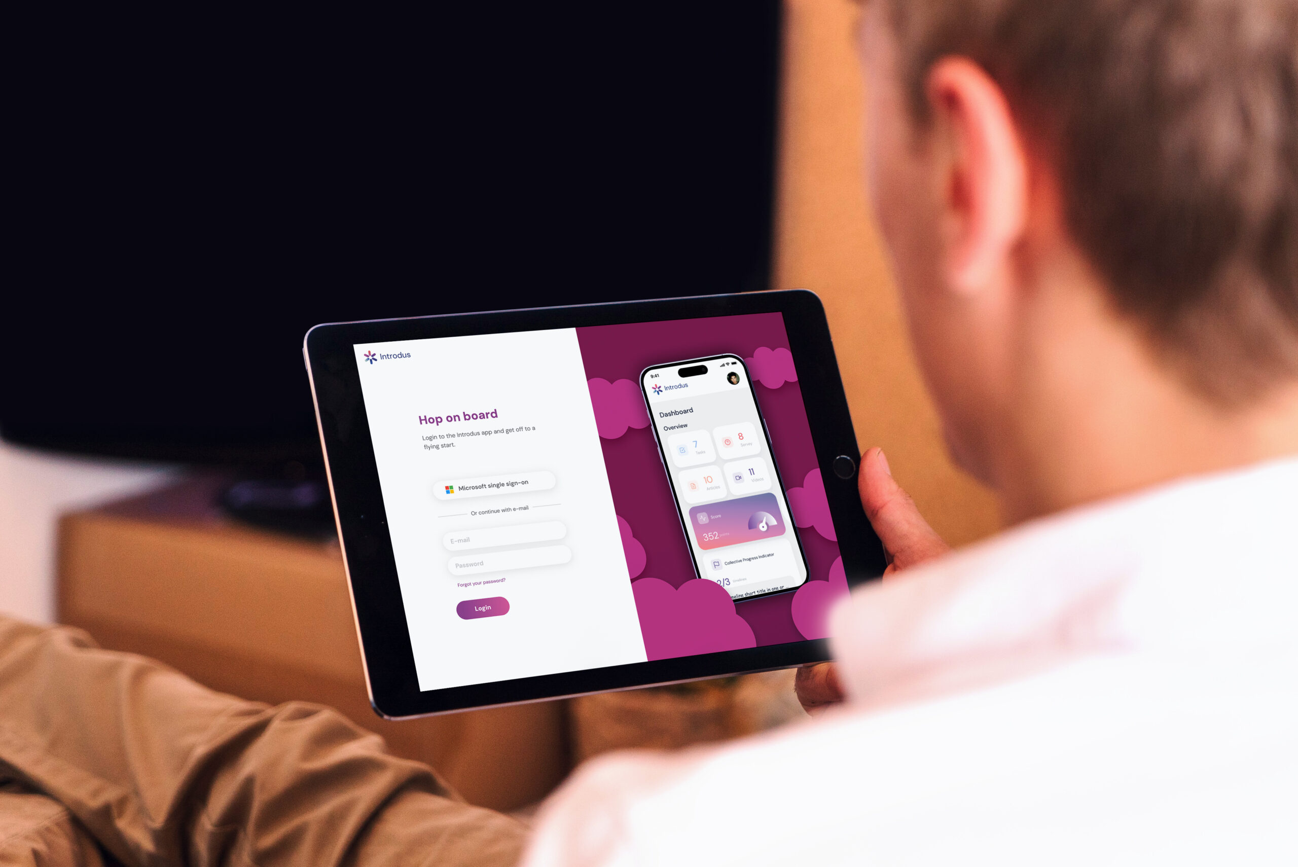

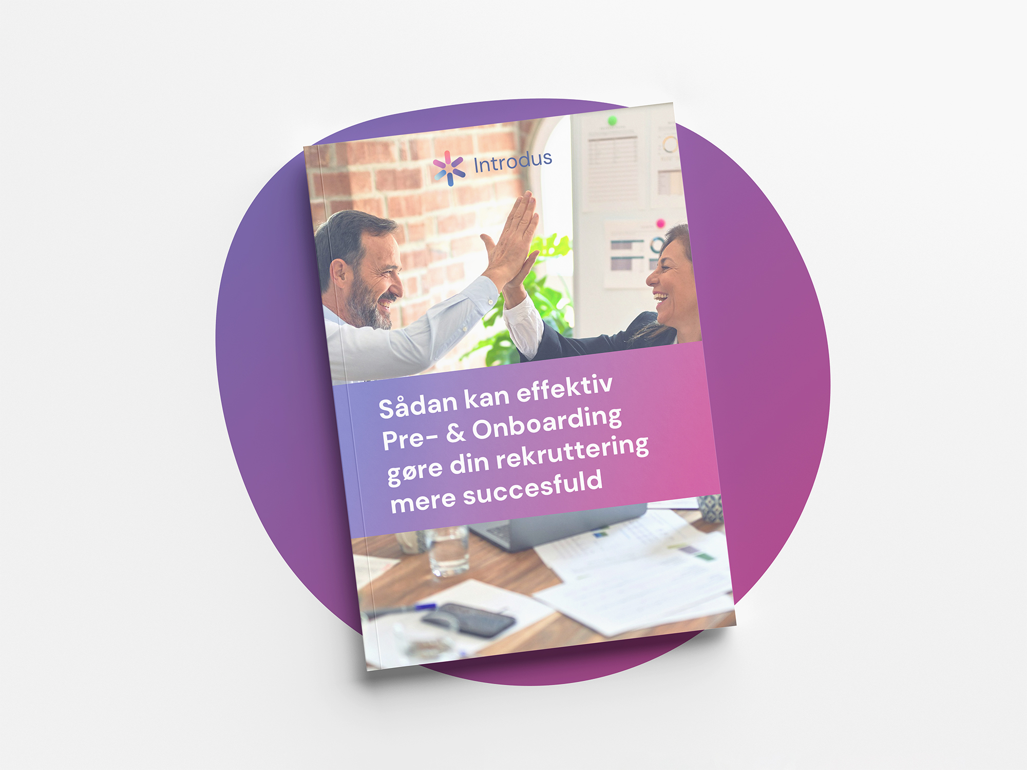
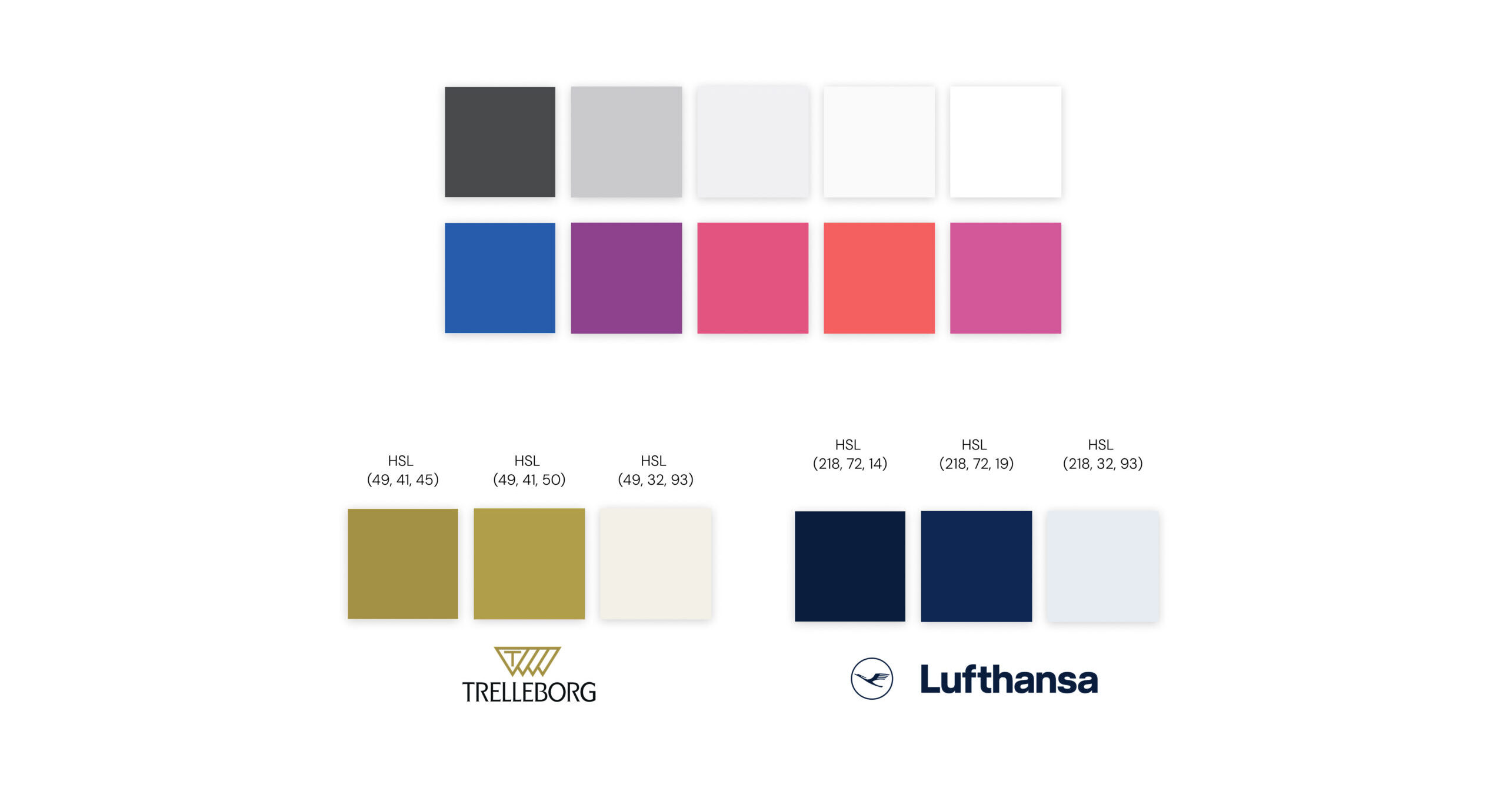
I tweaked the color palette to use the bluer/purple gradient tint amd introduced the epillipse as a design element.


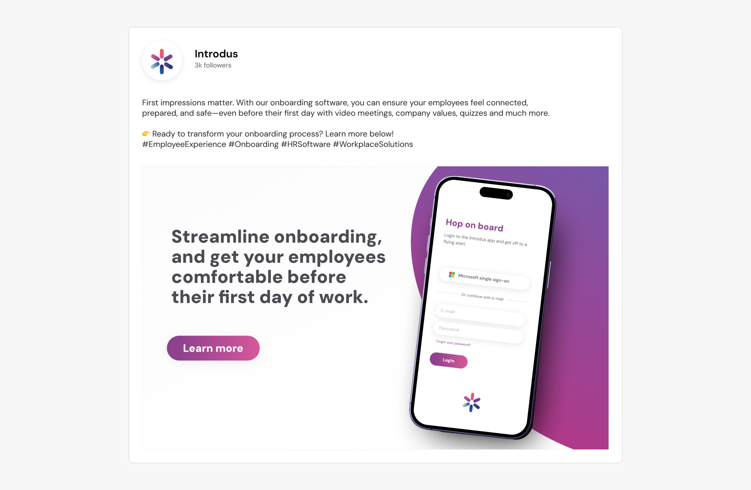
I created a clear branding language focusing on the Introdus applications ease of use – our biggest USP.

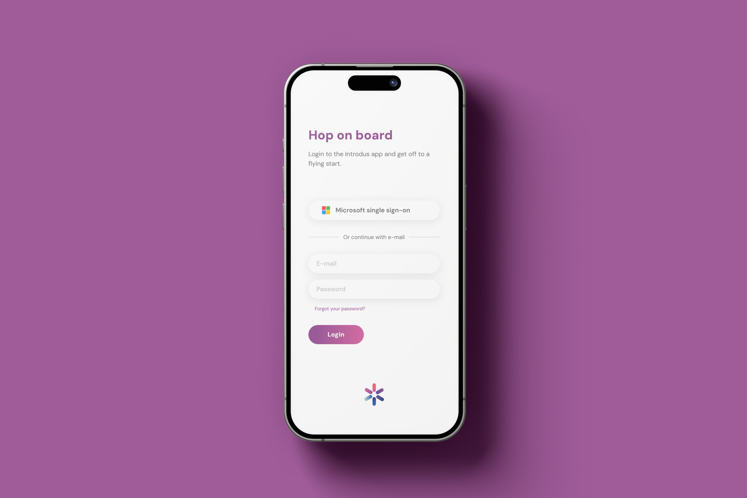
the introdus application/platform was fully redesigned using FIGMA.


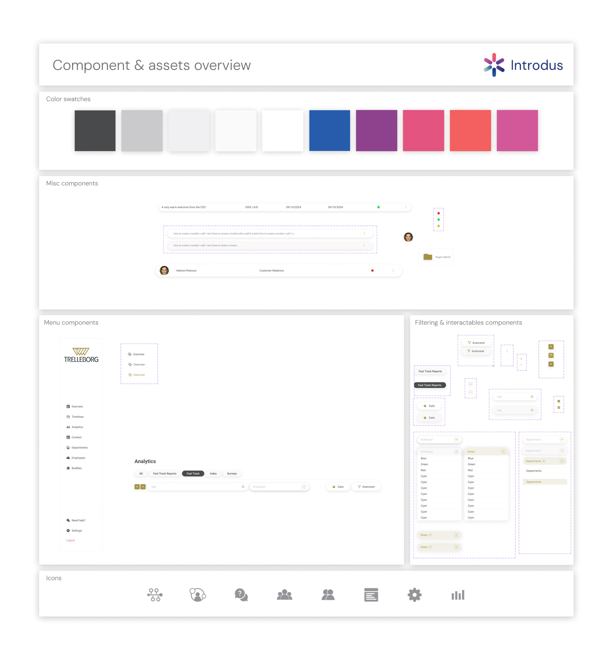
The Figma prototype was built mainly using components and states.

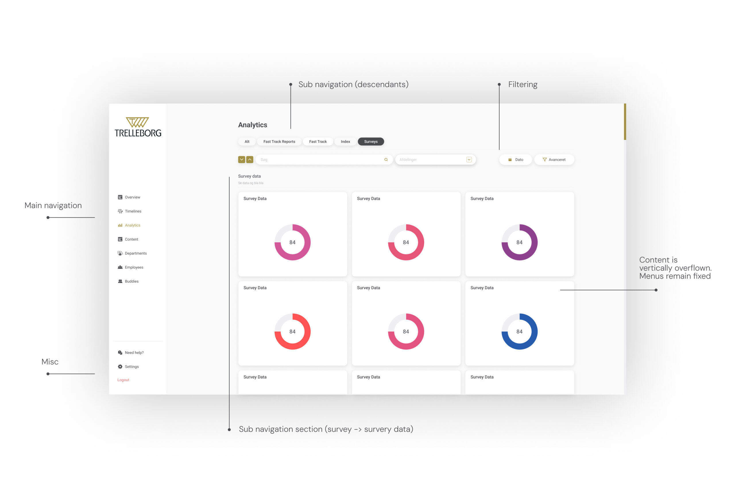
Navigation now requires half the clicks compared to before. This is achieved through splitting the navigation into overflows on both axis, and making the subnavigation menus alwayse exposed.

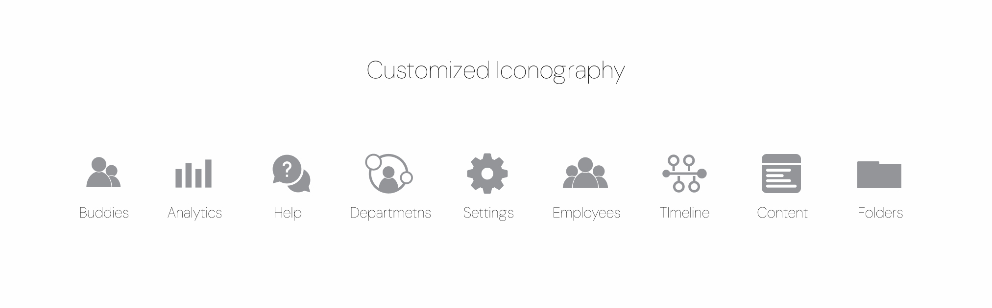
To increase the brand cohesion and make the application feel unique, I designed custom app icons.

The app allows companies to have their own branding. To streamline the process of setting this up, I created a HSL swatch system.

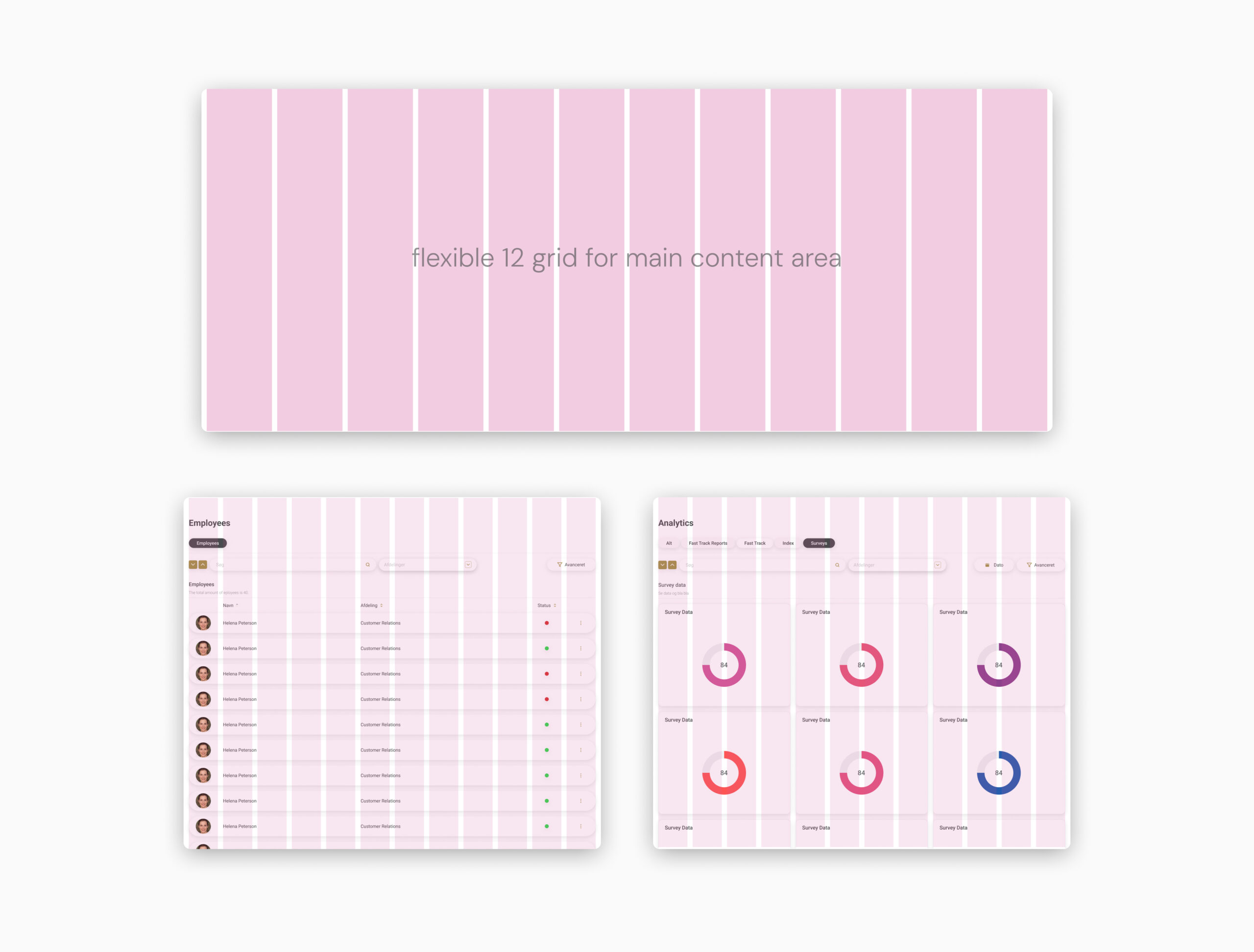
The design if fully flexible, responsive and ready for the developer to implement.

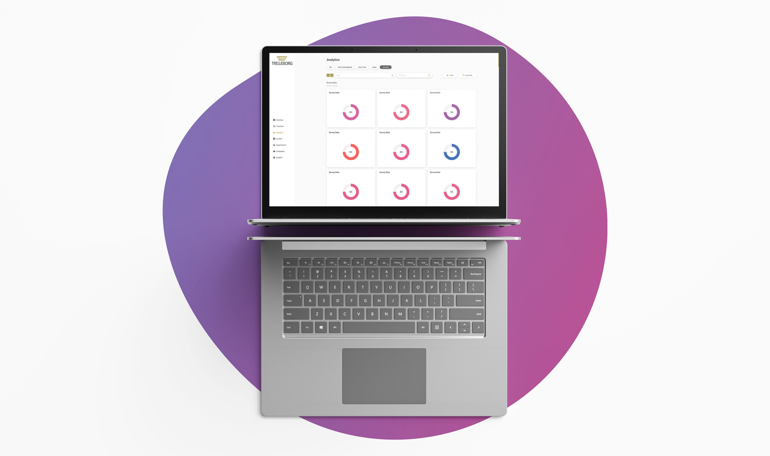
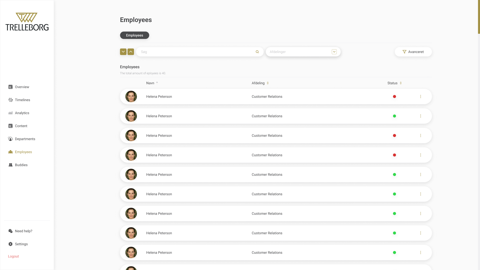
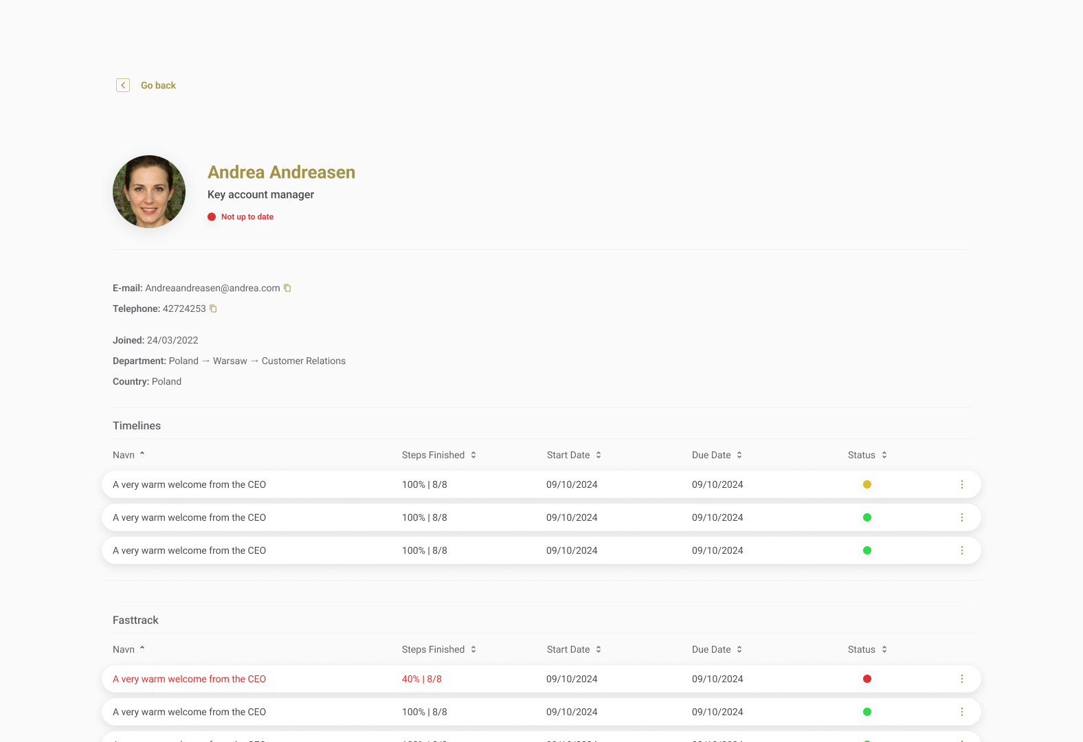
The vast amount of data and information is now presented in a clear layout.