Town and Towers Records
Brand Identity
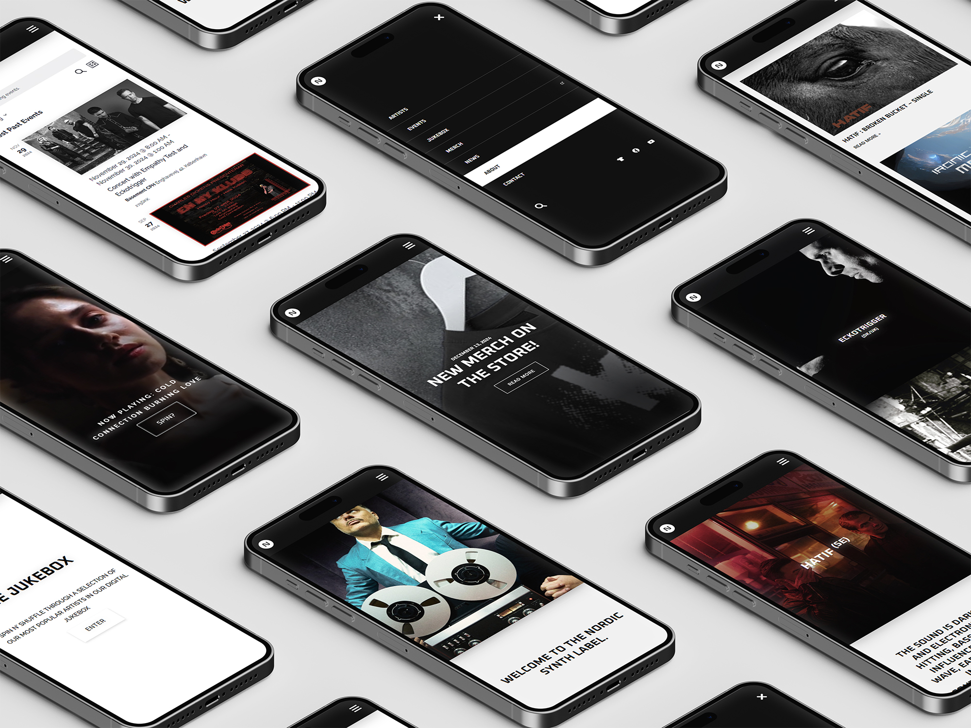
Town and towers, an indie synthpop record label based in Denmark, needed a fresh brand identity and website. I developed a cohesive visual style and a fully functional WordPress site inspired by the artists, the glitchy off-beat 80s aesthetics, and the imperfect charm of indie music.
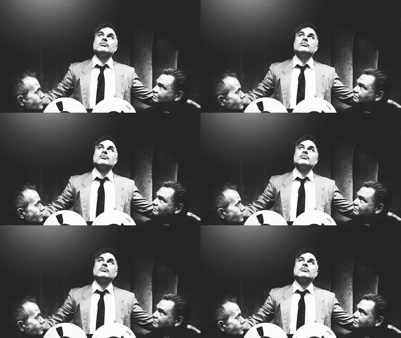
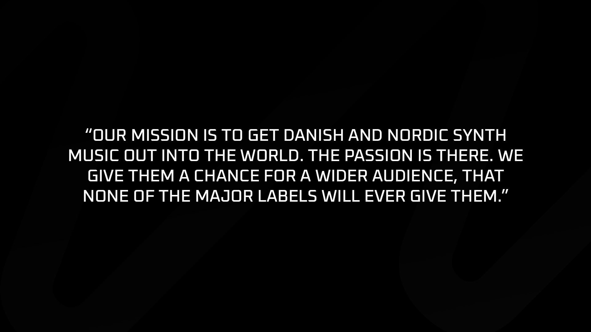
a toolbox and brand guide was created for the label. heavily inspired by the 80’s synthpop and the analogue culture. For example the “n” logo can be transformed to wavelenghts.

the fonts Raleway and oxanium REPRESENT THE PERFECT BLEND BETWEEN THE indie style and the futuristic scifi – iconic to the 80’s.
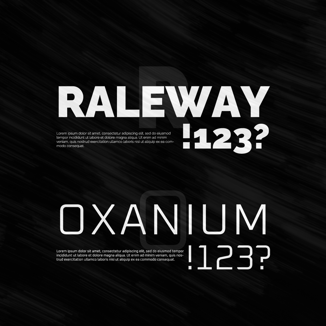
The fonts support many styles and typographic setups and gives a clear distinct brand identificaiton – even without a supporting logo.
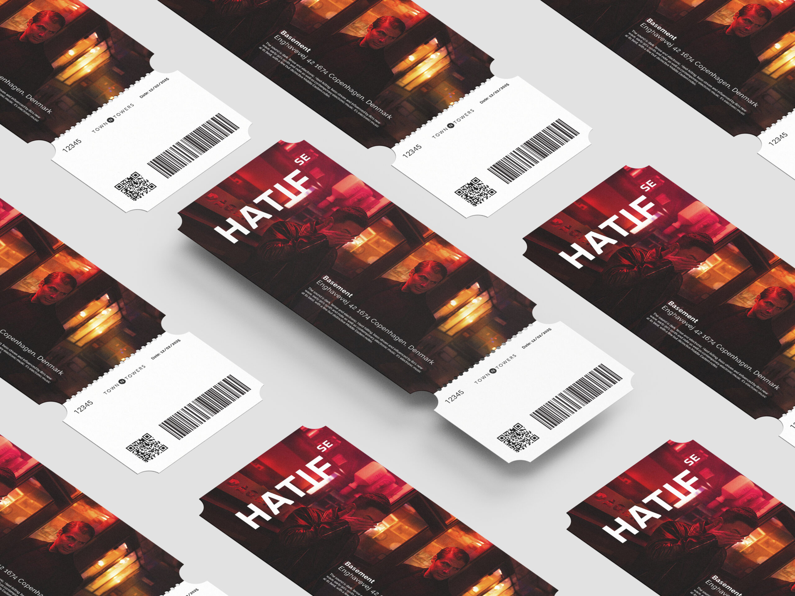
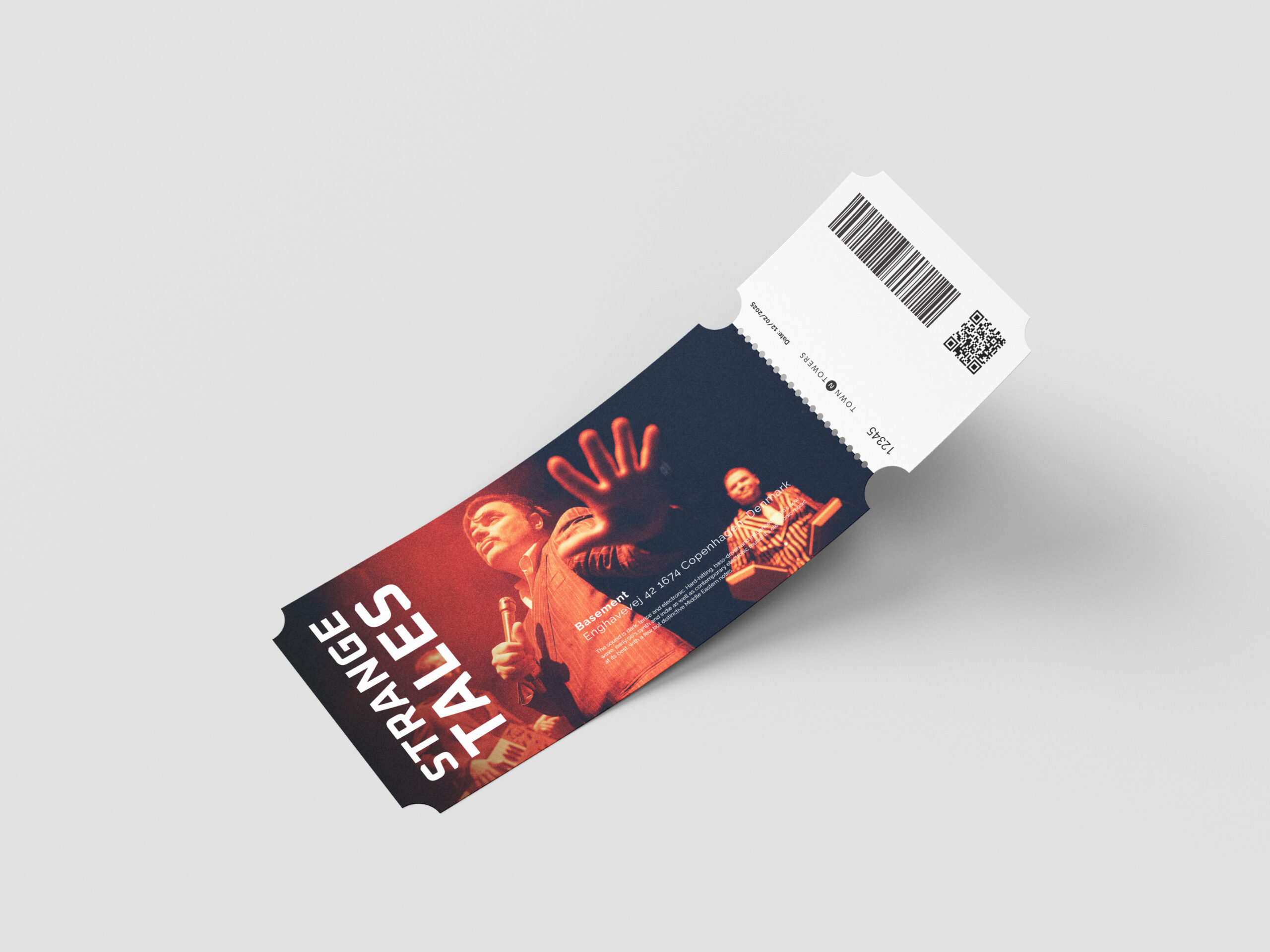
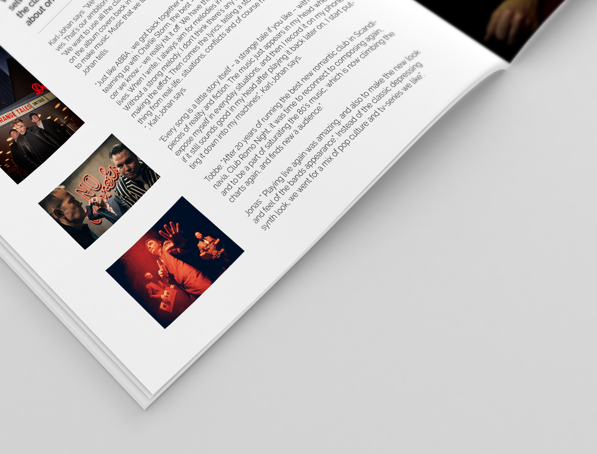
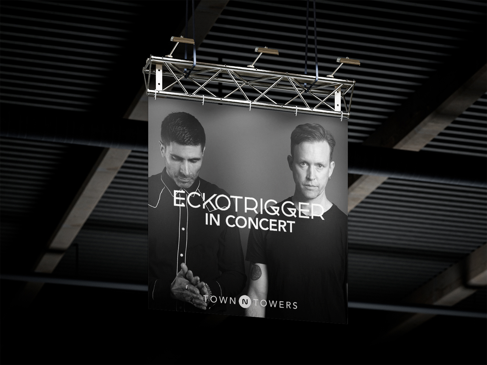
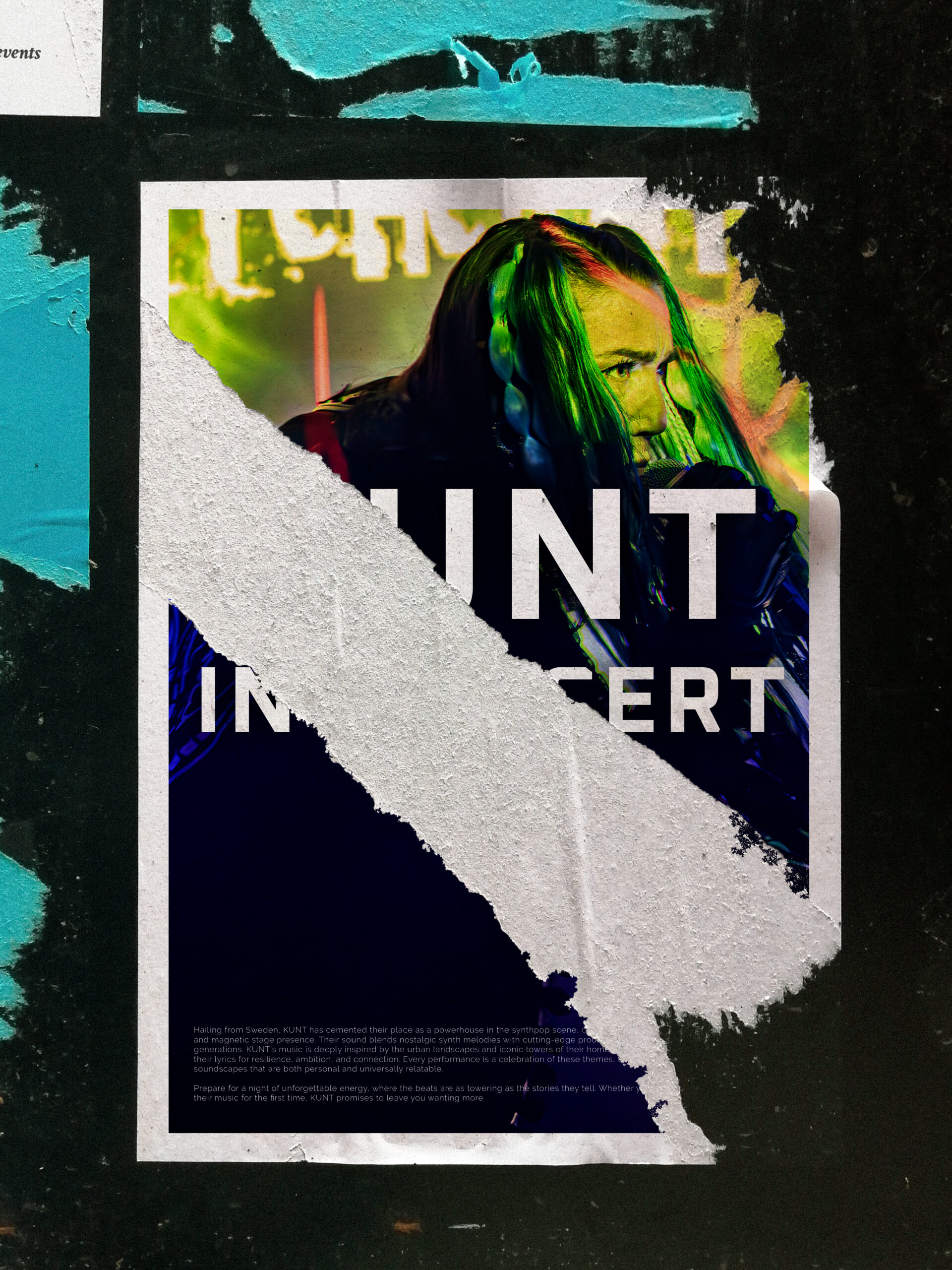
The logo is flexible and can be used in many contexts – a must with over 30 artists, and different formats to be displayed.

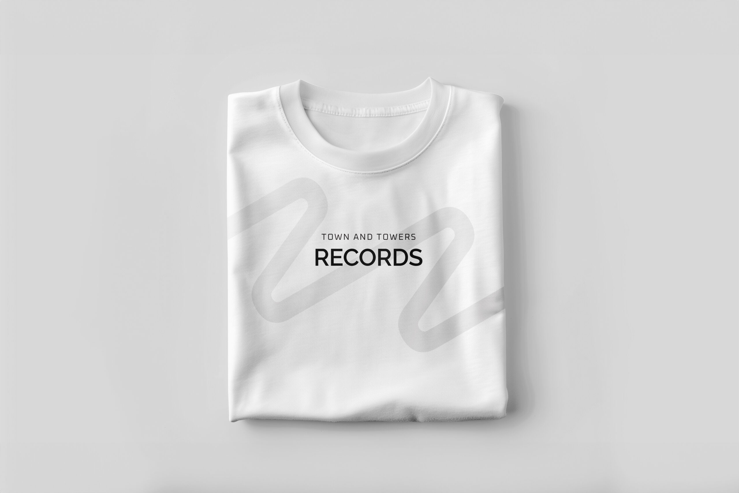
When creating the brand, the design philosophy was – it needed to work perfectly in junction with the artists.
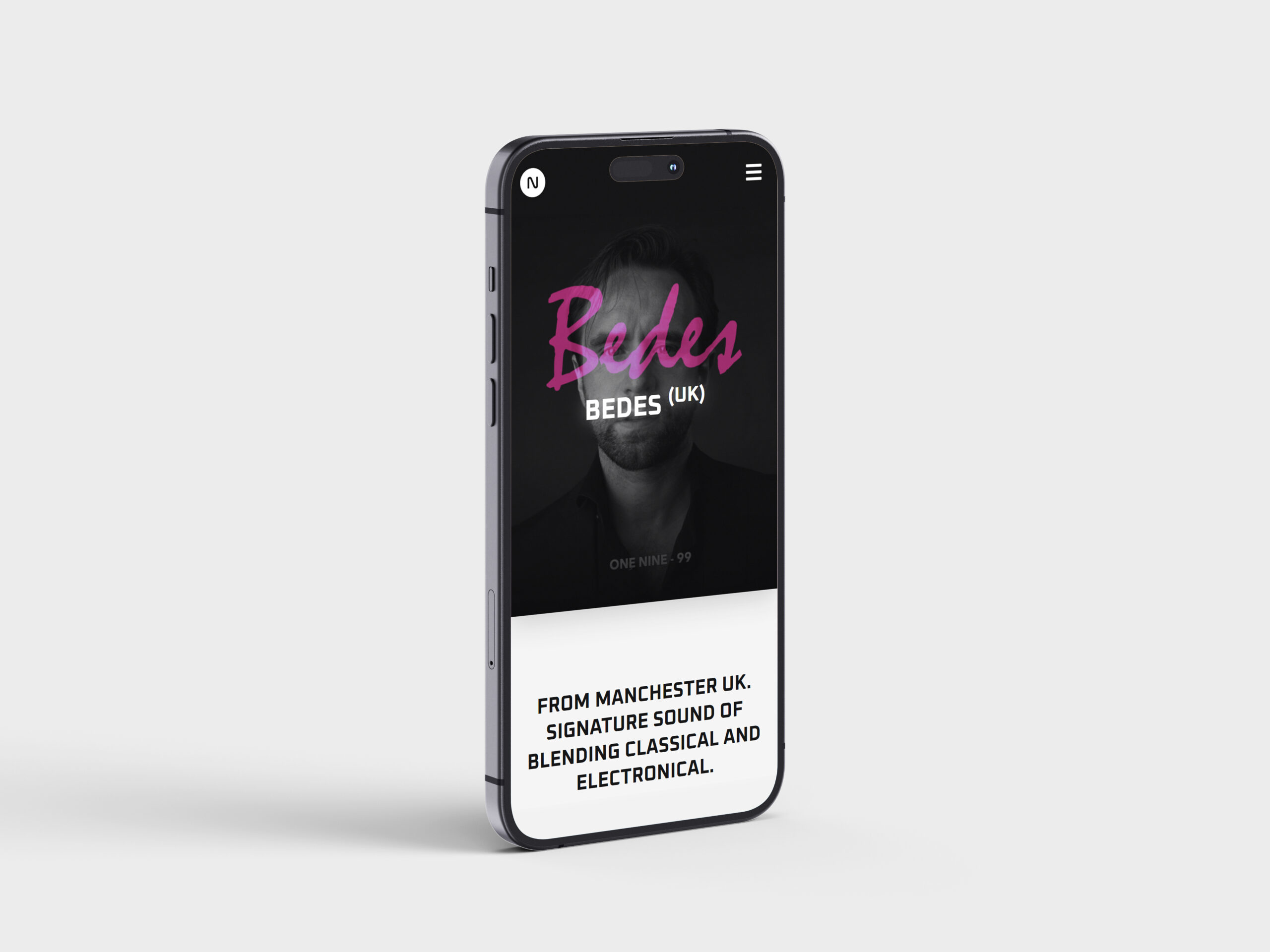
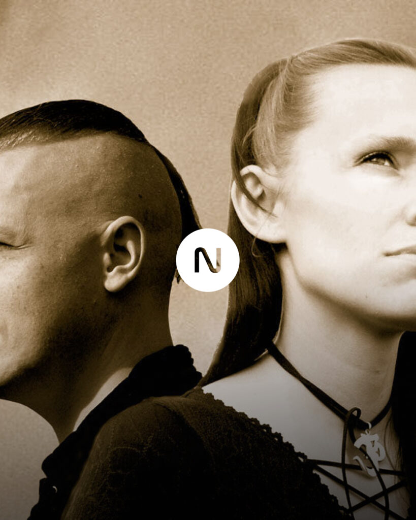
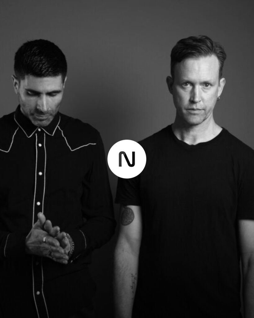
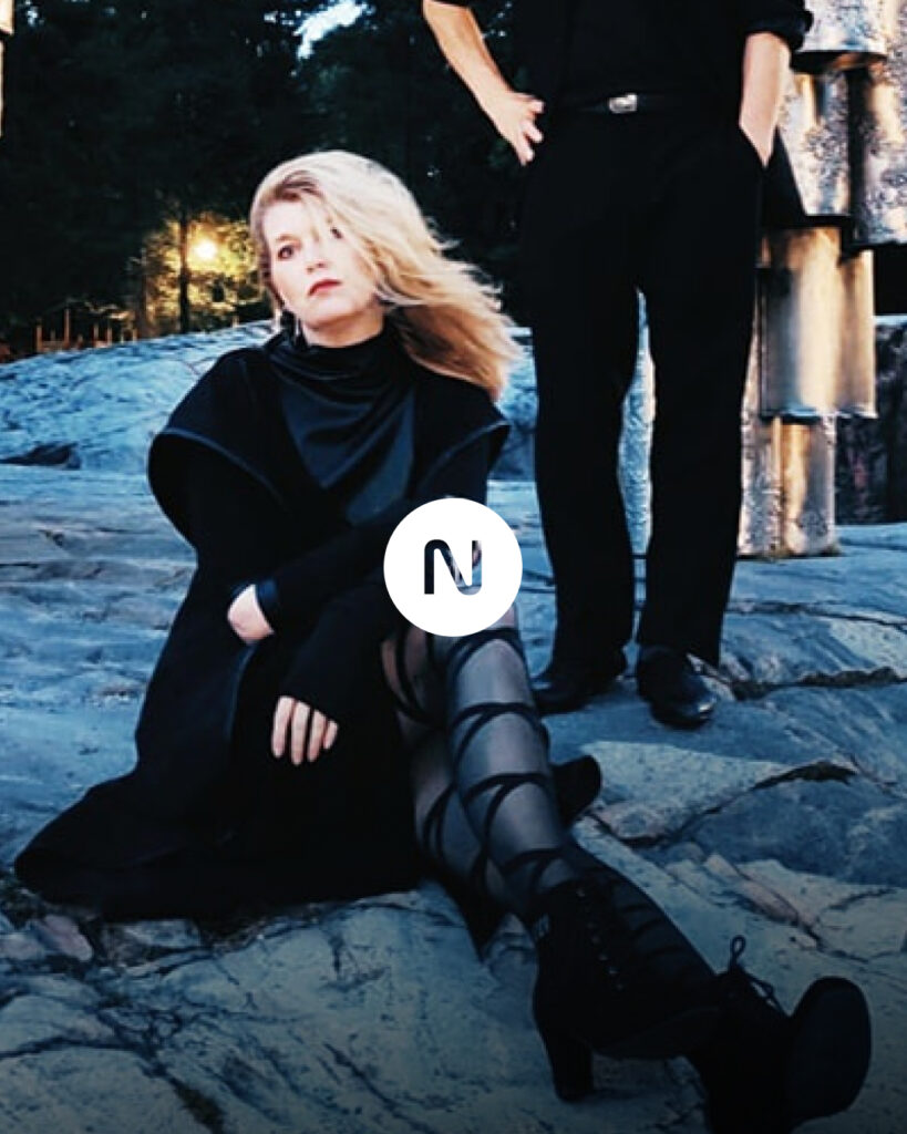
The website is a world to be discovered in itself. this is achieved using textures and light effects. representing the label and its artists through an analogue 80’s scope.